Improving Readability with MatchHeight.js
In this tutorial I will use MatchHeight.js - a jQuery plugin - to dynamically equal the height of HTML elements, providing consistent spacing and improving readability.
Why do we need this?
Let’s say we have a list of movie titles, descriptions and dates shown in a row of columns on a page. Typically, stacking each of these elements would result in the content appearing directly underneath each other, like the image below:
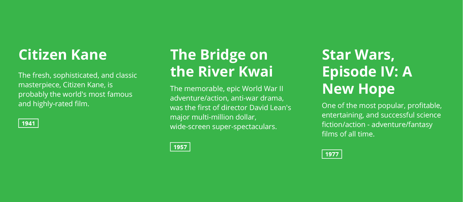
However, that can cause usability issues for the reader.
Sure, reading vertically through each title, description and date is not an issue, but, the reality is that most people will not read the content throughly, they in fact first read horizontally - scanning quickly from left to right, looking for sub headings and critical information following an F-Shaped Pattern, only after finding something of interest do they read vertically.
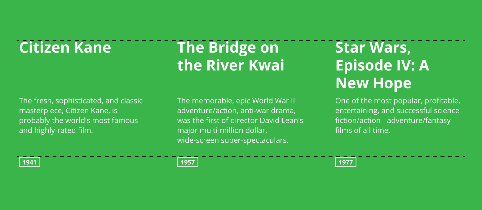
Improving readability
By simply equalling the height of the titles, and the descriptions we are able to align each of the elements onto a horizontal grid - this additional whitespace improves consistency and now our audience can easily scan through the content.
Building the solution with MatchHeight.js
- Download MatchHeight.js.
- jQuery is required so make sure that is included first.
<script src="jquery.matchHeight.js" type="text/javascript"></script>- Build your page layout, in our case we will use three columns, in a row. Each column contains a
.title,.descriptionand.labelelement. We will use flexbox andcalcto create the column layout and make it responsive.
<div class="row">
  <div class="column">
    <h2 class="title match" data-mh="title">Citizen Kane</h2>
    <p class="description" data-mh="desc">The fresh, sophisticated, and classic masterpiece, Citizen Kane, is probably the world's most famous and highly-rated film.</p>
    <div class="label">1941</div>
  </div>
  <!-- Repeat column three times -->
</div>
@import url('https://fonts.googleapis.com/css?family=Open+Sans:400,700');
html,
body {
background: #39b54a;
color: white;
padding: 0;
margin: 0;
font-family: 'Open Sans', sans-serif;
font-size: 14px;
}
.row {
max-width: 880px;
margin: 0 auto;
display: flex;
flex-wrap: wrap;
flex-direction: row;
padding: 1rem;
}
.column {
width: calc(100% - 2rem);
margin: 1rem;
@media only screen and (min-width: 500px) {
width: calc(50% - 2rem);
}
@media only screen and (min-width: 680px) {
width: calc(33.333334% - 2rem);
}
}- Add some element styling:
.title {
  font-size: 2.1rem;
  margin-bottom: 1rem;
}
.description {
  margin-top: 0;
  margin-bottom: 1rem;
}
.label {
  display: inline-block;
  padding: .15rem .6rem;
  border: 2px solid white;
  font-size: .875rem;
}- Trigger the MatchHeight.js plugin with a script that runs on page load:
//Match title height
function MatchHeight() {
  $('.match')
  .matchHeight({})
  ;
}

//Functions that run when all HTML is loaded
$(document).ready(function() {
  MatchHeight();
});
How does it work?
This script will look for the all elements with the .match class, find the tallest, and resize all others to equal it. You will see that I added this to class to our .title element.
Now that the MatchHeight plugin has been triggered on the page we can make it resize our .description elements also - we do this using the data-mh="group-name" attribute. This attribute will group all elements with the same ‘group-name’, check for the tallest, and resize the rest to match.
Note that there is no need to apply the .match class on any other elements - just use the data attribute, like I have done in this example:
...
<h2 class="title match" data-mh="title">Citizen Kane</h2>
<p class="description" data-mh="desc">The fresh, sophisticated, and cl...</p>
...
<h2 class="title match" data-mh="title">The Bridge on the River Kwai</h2>
<p class="description" data-mh="desc">The memorable, epic World War II...</p>
...
<h2 class="title match" data-mh="title">Star Wars, Episode IV: A New Hope</h2>
<p class="description" data-mh="desc">One of the most popular, profita...</p>
Now we have a page with 3 columns, each with an equal-height title, and an equal-height description.
Demo
Check out the pen below for all the code.
See the Pen Equal Height Titles - MatchHeight.js by Matthew Elsom (@matthewelsom) on CodePen.
Why not use CSS only?
- Building a robust and responsive framework that equally sets the height for arbitrary content in pure CSS is difficult…
- It can be partialy done using flexbox, but only partialy.
- MatchHeight.js is a fast and browser compatible way to do it without hacks or trickery.